48 DIY Tips, Tricks Everyone Needs To Know
Expert interior design tricks for a dream home

It's said there's a world of difference between a room designed by a professional interior designer and one done by a home decorator. From balancing color schemes to hanging artwork, planning lighting and even positioning curtains, designers have a box of tricks that can turn an average scheme into a fabulous space.
We've rounded up some of the trade's best-kept secrets for you to take your own décor to the next level. Click or scroll through but, shh – just keep it quiet...
Highlight woodwork
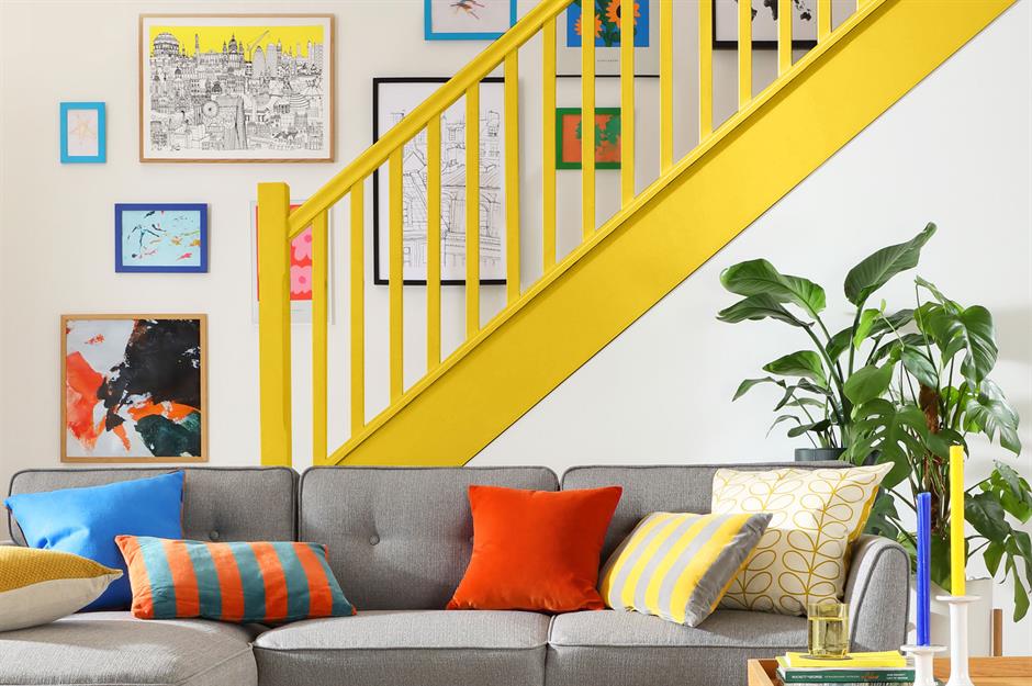
Skirting boards, banisters, and door frames are often an afterthought and lack interest. Why not brighten them up instead with a fresh face of color?
This contrasting staircase painting sunshine yellow is a fabulous feature in an open-plan living room. When choosing brighter colors it's best to stick with a matt or satin finish rather than gloss.
Decorate with plants

Adding greenery to your decorating scheme instantly injects color and style into the look. Houseplants go with every scheme and as well as purifying the air they offer a sense of balance and well-being.
Senior Resident Services Manager, Kimberley Pope, at Grainger plc, says: “Self-watering tools are a great option to take the stress out of keeping your little green friends alive. Plus, placing mirrors opposite dark corners not only allows more natural light to be absorbed by the plants, it also naturally brightens the home and creates a more spacious feel."
Sponsored Content
Don't forget windows
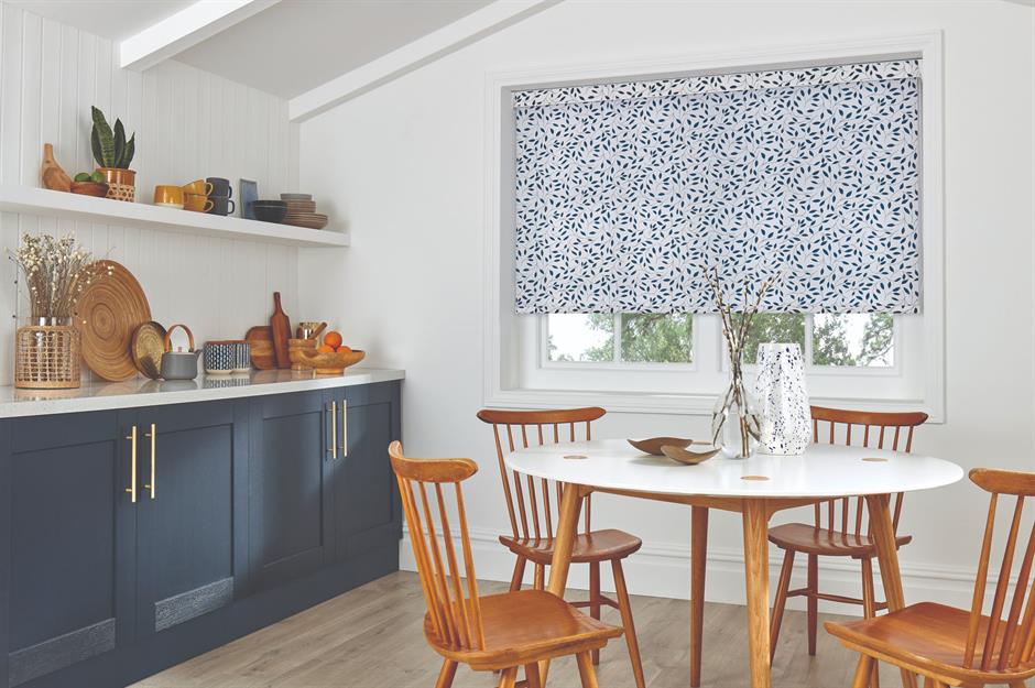
A window treatment is a fabulous place to inject a shot of pattern or color into an otherwise simple scheme. It's a less permanent option and offers intriguing attention to detail.
Owner and founder of Ada & Ina, Soile Makkonen says: "Well-chosen window treatments can complement the interior of a room, tying together different elements and creating a cohesive look. They help control the amount of natural light entering a room, which can reduce glare, protect furniture from sun damage, and create a pleasant ambiance. Choose colors and patterns that complement the room's decor. Neutral tones can create a calm atmosphere, while bold colors or patterns can make a statement and add character to the room."
Work around a hero feature
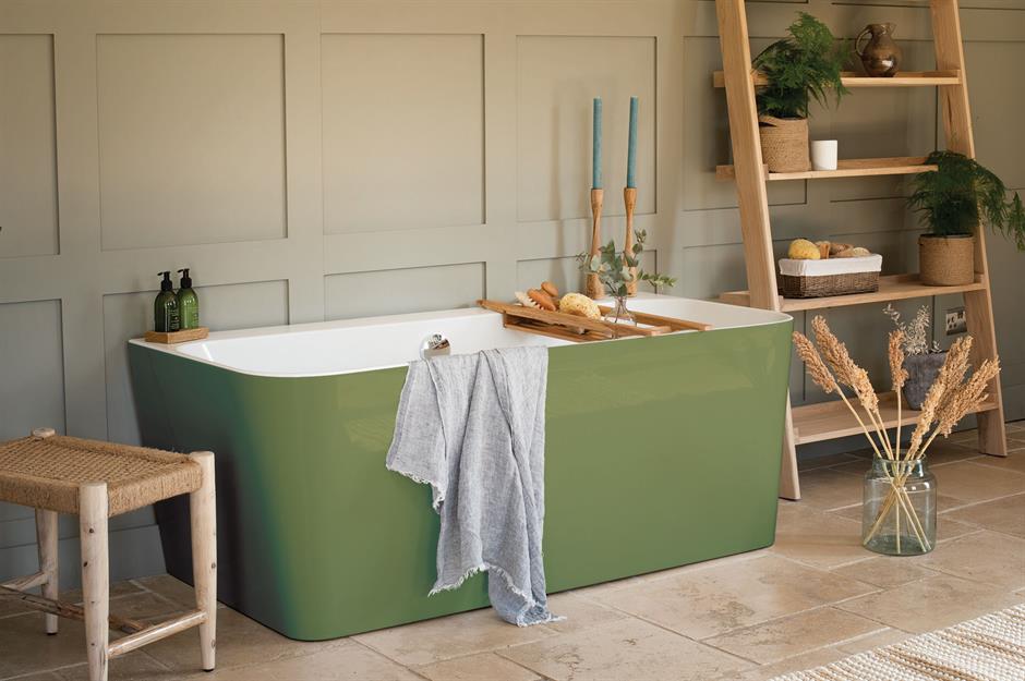
Choose a star product to be your feature as the main focal point of the room. Then use other items to blend into the backdrop to create a calming vibe rather than a cluttered one. This striking green bath makes a striking focal point that's supported perfectly with tonal wall panels and leaning storage.
Take design tips from nature

You don’t have to spend hours scouring through pretty pictures of interiors to find your dream scheme. Look around and you’ll start to see inspiration everywhere – from the soothing texture of pebbles on a beach to woodland walks in autumn. Take photos and use them to help you create a concept board to inform your design.
This cozy bedroom draws on autumnal tones and motifs, from the russet leaf print bed linen to the warming wood furniture.
Sponsored Content
Celebrate the ceiling

Ceilings don’t tend to get a lot of love on the whole. Boring old white with perhaps a bit of color on the cornice is usually about as exciting as it gets. But creating a statement ceiling by painting, papering or even adding a mural can give a room an instant lift.
Painting a ceiling in a dark color can make a space feel warm and cozy, while metallic paints or faux tin tiles give it a more Art Deco look.
Use the whole room

Don't feel you have to line your furniture up along the walls. Bringing sofas and armchairs or even home office desks into the center of the space will create a sociable seating space and practical office.
This works particularly well in open-plan spaces with large windows. Facing furniture towards the glazing means you can make the most of natural light.
Obey the golden ratio

The golden ratio is a proportion often seen in nature and has served artists well for centuries. Interior designers can put it to good use too and create schemes that feel effortlessly harmonious. It works by dividing spaces into approximately two-thirds for one section and one-third for the remainder.
In this modern scheme, the furniture takes up about 60% of the floor space and the cushions leave 60% of the sofa clear.
Sponsored Content
Learn the art of symmetry
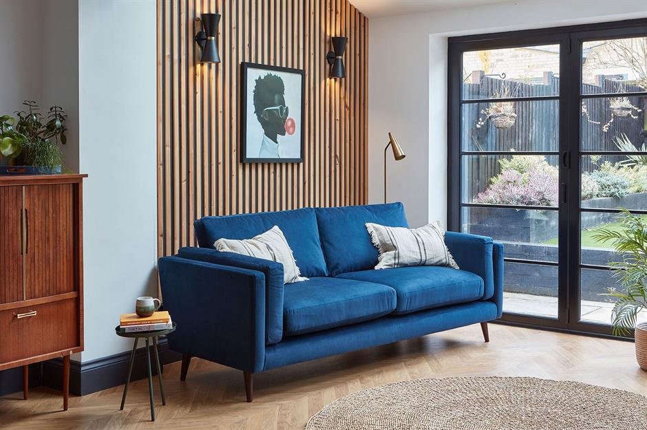
Symmetry can work in smaller spaces to offer balance and elegance. For instance, this living room nook with symmetrical wall lights has become a smart feature thanks to horizontal and diagonal lines that follow a pattern.
Liking this? Click on the Follow button above for more great stories from loveMONEY
Use the 30/70 split

Here’s another handy trick for getting your proportions right and balancing different styles within the same space. A guaranteed way to give a room character is to decorate about 70% of it in a particular style and then complete the remaining 30% in a completely different style.
You can spice up a largely traditional scheme with a smattering of contemporary items, or vice versa as Instagrammers Marisa and Chris of @oakappledecor illustrate in their snug room that's bursting with character.
Play with pendant lighting
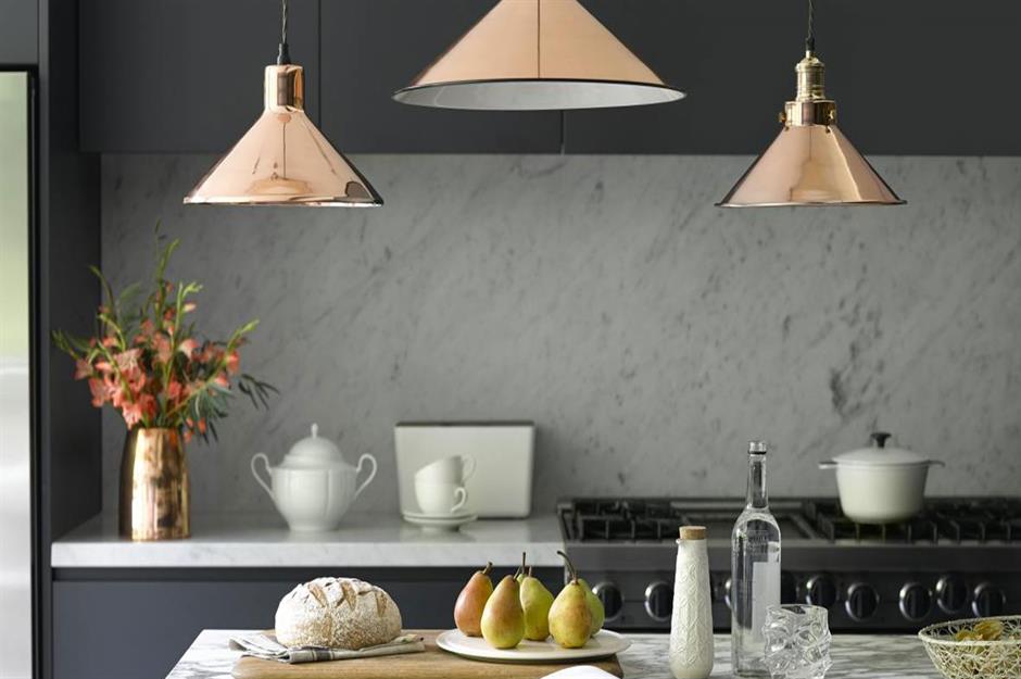
One of the most common questions interior designers are asked is how high to hang pendant lighting. The answer depends, to some extent, on the size and style of your light, the height of your ceilings, and the height of the people living in your home, but here are some useful guidelines: in a living room or hallway, hang your light about 7.9 feet from the floor, above a dining table, leave about 2.5 feet between the tabletop and your pendant.
If you're hanging pendant lighting above an island for statement kitchen lighting, leave about 2.6 feet between the countertop and the bottom of the light shade.
Sponsored Content
Tile walls and floors with the same tiles
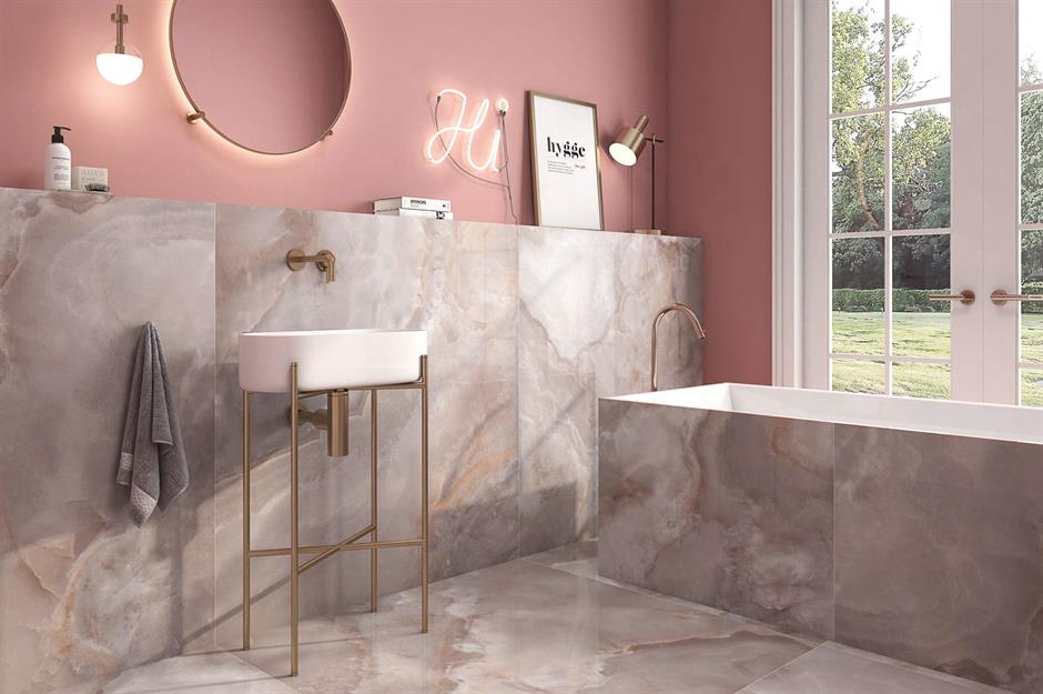
Who says you can't use the same patterned tiles on both walls and floors?
Carry them up from the floor to the ceiling for a standout yet seamless design with maximum impact. Hotel designers often use this trick to increase a sense of space.
Pay attention to hardware
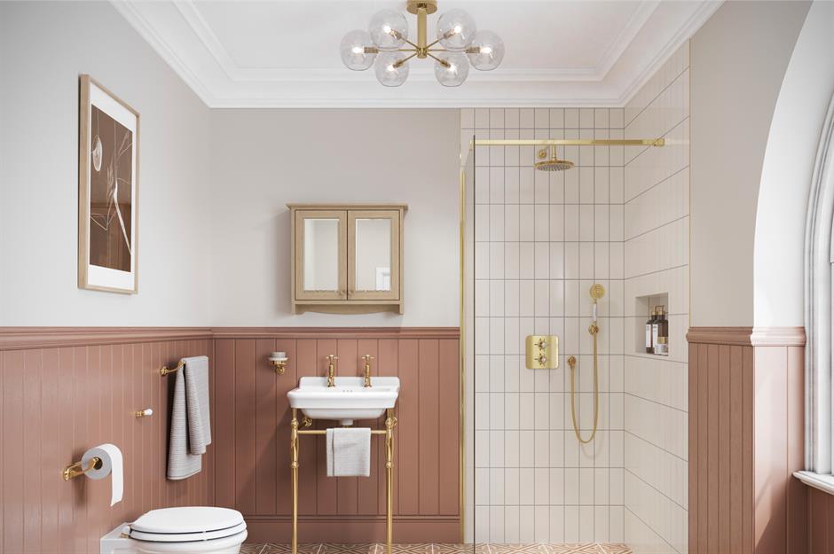
Updating hardware in kitchens and bathrooms with shiny metallics or matt black finishes will add an air of luxury and finesse to the room and create an instant high-end vibe.
Team gold-toned fixtures and lighting with a Victorian-style vanity basin for a traditional yet high-end bathroom scheme.
Stick with classics
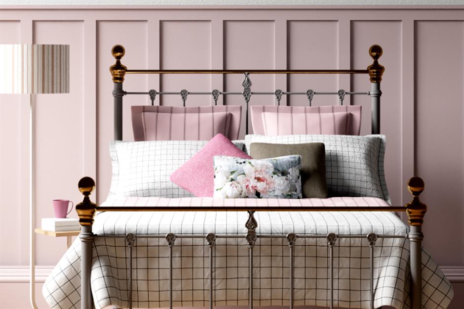
Although it can be fun to follow trends sticking to traditional furniture is sensible if you are on a budget as the staple piece will not date.
Timeless pieces, like this low-footed iron bed with brass finials will give a room character when teamed with eclectic accessories. Why not invest in an eiderdown quilt to finish the look?
Sponsored Content
Use rugs wisely

Rugs are the ultimate way to draw an interior design scheme together, but go too small and the rug will look lost and your scheme will fall flat. Ideally, a rug should be big enough that some or all of your furniture’s feet can sit on it.
Consider using rugs in different ways, too – whether it's a few overlapping each other or even hung in place of wallhangings. When using rugs like this Swedish-style one in thoroughfares and hallways ensure anti-slip fabric is placed underneath to avoid accidents.
Invest in a headboard
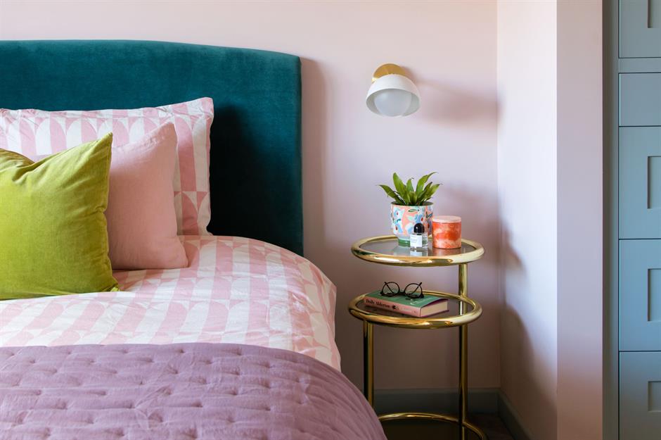
To give your bedroom a sophisticated hotel vibe invest in an upholstered headboard that's smart and looks luxurious. A standalone frame will cost less than an expensive bed but offer the same striking results.
For a punchy finish, choose a shade that contrasts with the backdrop. This teal-toned velvet headboard looks divine set against this peachy-painted wall.
Layer up an outdoor room
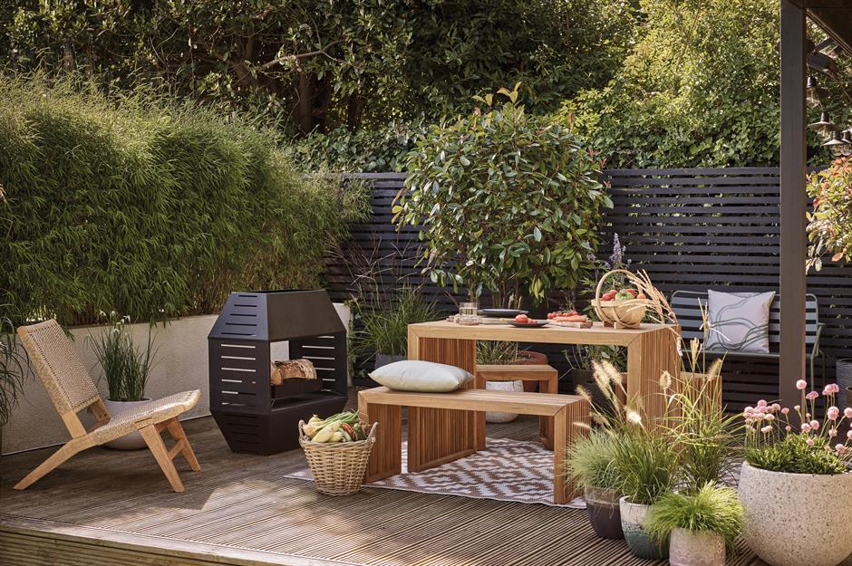
Planning an alfresco dining room for outdoor entertaining? Treat your exterior space as you would a living room scheme and factor in rugs, lighting, comfortable seating, a dining set, and areas to pop drinks.
Paint fences, light a firepit, display artwork (you can buy prints specifically for the outdoors, to survive the elements), and hang plants. Lastly, use an outdoor rug to ground the scheme.
Sponsored Content
Start with a neutral backdrop
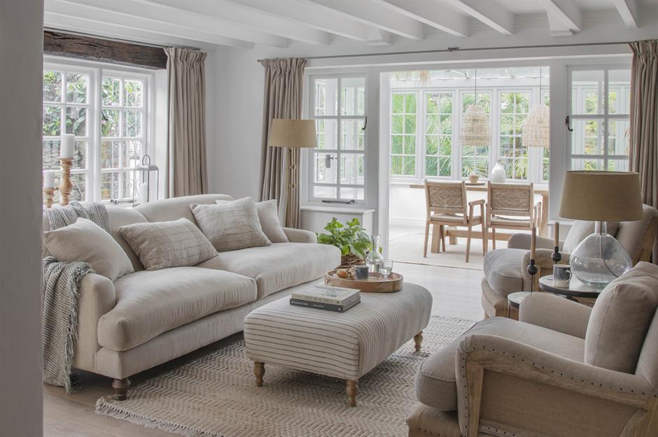
Interior design guru, Joanna Gaines, knows a thing or two about creating a gorgeous home. In her book Homebody: A Guide to Creating Spaces You Never Want to Leave, she suggests starting with crisp white walls, since they "can actually provide a neutral and clean foundation to design around that other colors can’t, giving you more freedom to get creative with decor.”
There are hundreds of whites, creams, and greys to choose from, so all you need to do is decide which is right for you. Ensure you add texture and comfort with layers of inviting soft furnishings.
Balance bathroom lighting
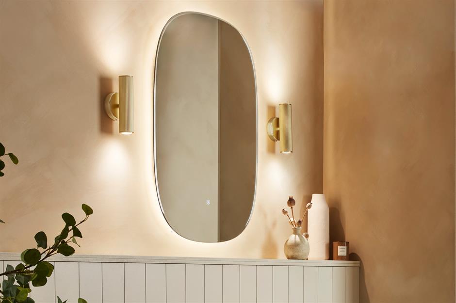
Not many of us would claim to look our best in the morning, but you can give yourself a head start by getting your bathroom lighting right. Never hang a bathroom sconce above the mirror – it will only make you look washed out.
Instead, install sconces on either side of the mirror as they'll light your face evenly and frame you in your most flattering light.
Layer soft texture
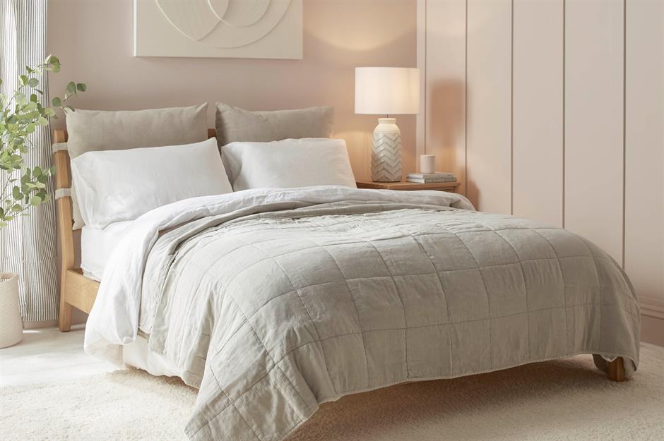
Texture is key to creating a successful design scheme, especially if you're working with a neutral color palette.
To keep a room interesting, start with a natural oak bed with feature fabric panels and incorporate different tactile materials throughout the space, from soft woolen throws to silky cushions or rough exposed brick walls to glossy mirrored finishes.
Sponsored Content
Opt for non-toxic paint
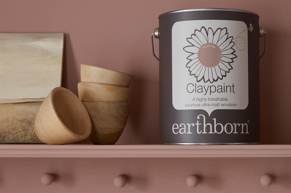
When choosing paint, it’s easy to put color first and forget other factors, such as how the paint might affect the environment or your health. Consider buying paints made from natural materials that contain no (or very low quantities of) harmful volatile organic compounds (VOCs).
They may be a bit pricier, but they’re a worthwhile investment, especially for a children’s room or when decorating a nursery. Plus, there is no need to compromise on color, this vintage dusty pink will take you on a trip down memory lane.
Always order samples
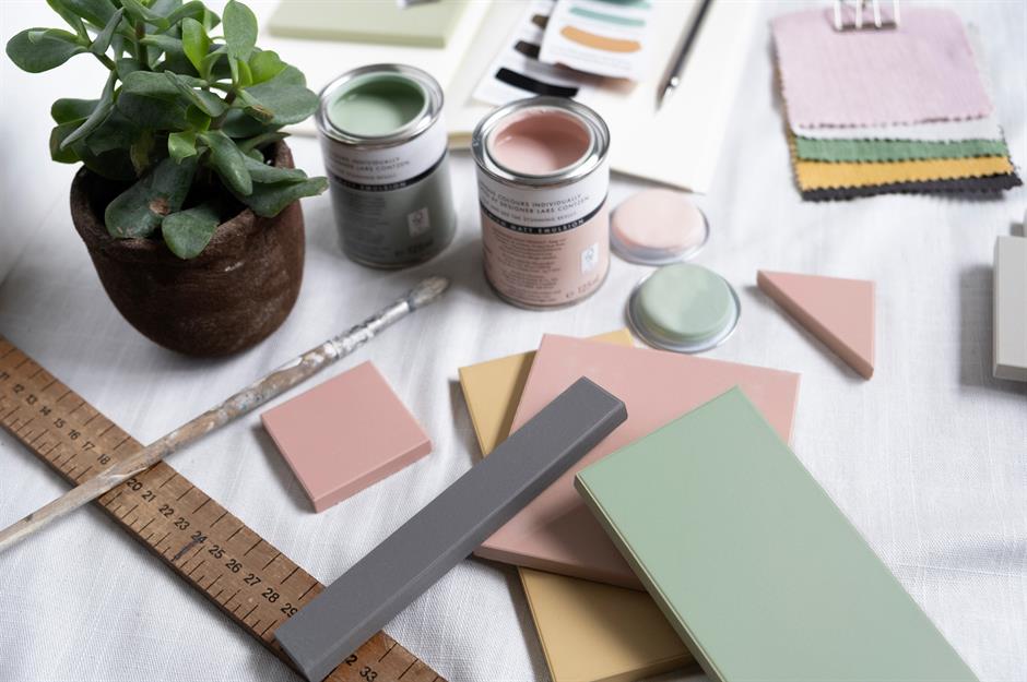
It might sound obvious, but many home decorators overlook samples when overcome with excitement about transforming their interiors. From wallpaper and paint, to flooring, tiles, and fabrics, you should always order a selection of samples before committing to any specific material.
Place the samples together, look at their quality, and visualize how all the elements will work together in the room. You could even get crafty and create a mood board, full of all your favourite swatches.
Go large with wall art
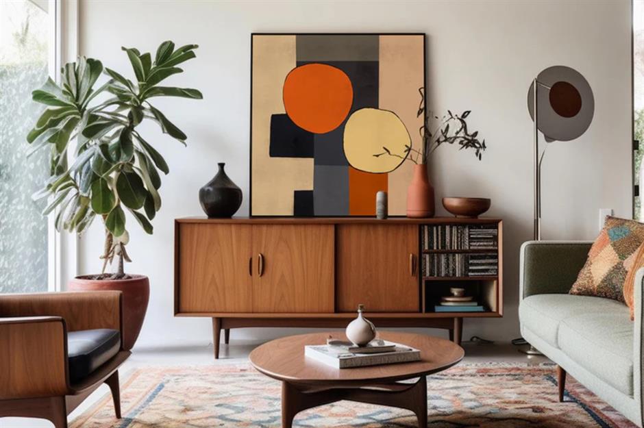
When it comes to art, it’s very much a case of the bigger the better. You can fake it to some extent by clustering smaller pictures into a gallery wall, but nothing compares to an oversized framed artwork that grabs your attention the moment you step into a room.
If oversized art is outside of your budget, try offsetting a smaller piece above a sideboard or sofa – hanging it centrally will make it look lost.
Sponsored Content
Measure dining room dimensions
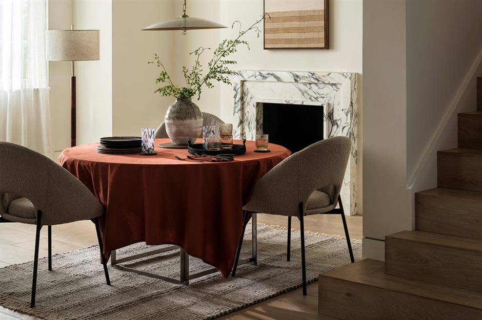
Dining tables often get squeezed in as an afterthought, but it’s worth thinking carefully about how much space you need to avoid bumping elbows while you eat.
The ideal dining table height is 2.4 feet, with 1.5 feet of legroom and 2.5 feet of space between the table and the wall so you can get up and sit down comfortably. Each place setting should be about 2.1 feet wide.
Upcycle drab furniture
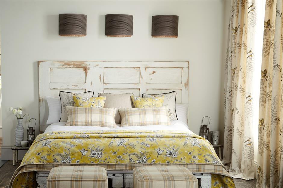
Being able to transform old furniture is an interior decorator's secret weapon. Whether turning mass-produced flat-pack designs into one-off pieces or sprucing up junk-shop bargains into shabby-chic heirlooms, like this old door that is now the rustic headboard to a pretty bed dressed in spring fabrics.
Repainting furniture is a simple way to add color and character to your home at rock-bottom prices. Go for an all-in-one paint that doesn't need a primer to cut down on prep time.
Accent with black

There is a misconception that black makes things look closed in and dreary but this isn't the whole story. Interior designers use it as an accent because it can actually enlarge the feeling of space by placing the darkest tone on an area you want to 'push back'.
The key is to use the bold shade sparingly to ground a room and tie the scheme together. Against a pale backdrop and used in repetition, the overall contrast adds a striking punch and looks undoubtedly chic.
Sponsored Content
Let natural light in

There is no substitute for natural light. It not only benefits our health and well-being but it also affects how colours appear. Always look at the light in your room before you decorate it.
South-facing rooms benefit from the maximum amount of light whereas north-facing will be darker, therefore, paint colors can seem a completely different hue from one room to another.
Add panelling to walls

Wooden wall panels aren't just for period properties. This decorative feature adds character and texture to contemporary homes too and is always popular. What's more, it may look expensive but budget versions made from wood alternatives like fibreboard and OSB are super cheap and, once mounted, can hide wall surfaces that have seen better days.
Tongue and groove panels make rustic schemes warm and cozy while framed and mid-height styles suit traditional looks and create a refined finish. Paint the panels in bold or muted tones for up-to-date appeal.
Style book shelves right
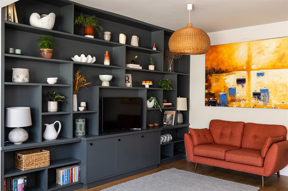
Learning the art of display makes the difference between practical storage and a beautiful feature. Here's how to make your painted media bookcase and bookshelves Instagram-worthy. Do not overcrowd the space, choose accessories in the same color and group items together in odd numbers.
Use books as objects and exhibit them both horizontally and vertically for interest. Aim for two-thirds of books, one-third of accessories, and make sure to include either plants, foliage, or flowers too.
Sponsored Content
Add seasonal updates

Paying attention to detail adds a professional finishing touch that creates interest and character. An effective way to achieve this is by accessorizing with endearing objects that echo the current season.
This autumnal display with woodland ornaments will make a warm welcome for guests nestled by the fire and can be easily updated for the holidays.
Wallpaper the bathroom
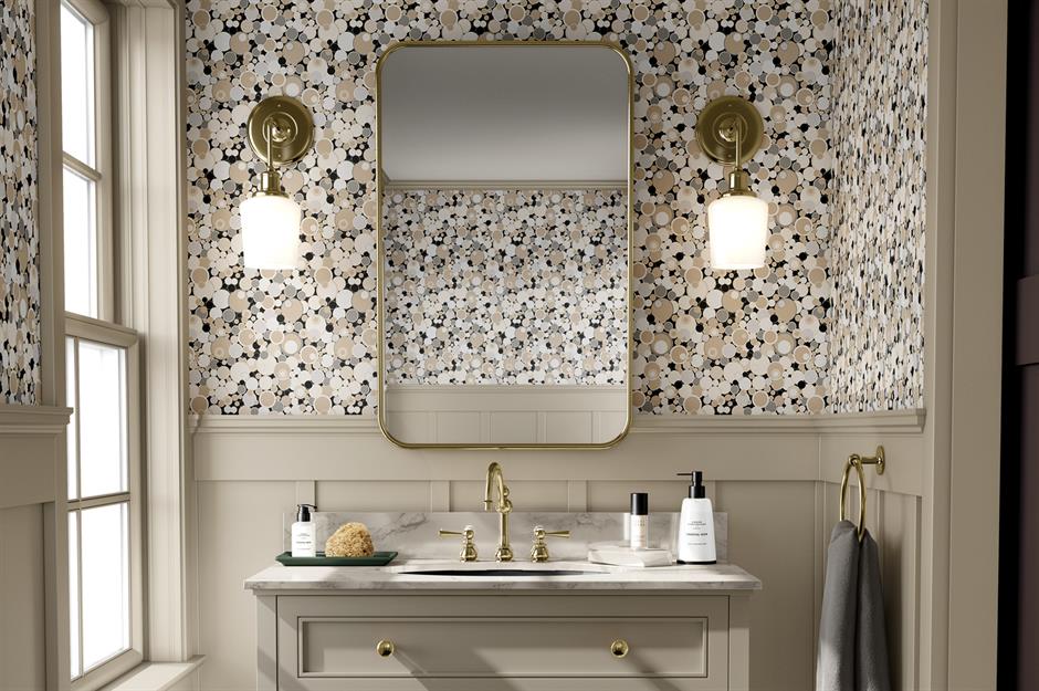
You don't necessarily need to stick to tiles in the bathroom. Wallpapering bathroom walls can make a beautiful style statement and it's a great place to use bold patterns and colors you might not use elsewhere.
Large prints look especially striking in small spaces so feature wallpaper can transform downstairs toilets. Look for specialist bathroom wallpaper that is wash and splash-resistant.
Get creative on walls

Whether it’s painting chequerboard squares on a wall, as shown here, creating a detailed mural, or going for a freestyle pattern of monochrome dashes, there are so many ways to use paint to create an innovative look on a budget.
Think outside the box and carry your painted effect onto ceilings, around corners, and onto door frames for added interest.
Sponsored Content
Start with a statement sofa
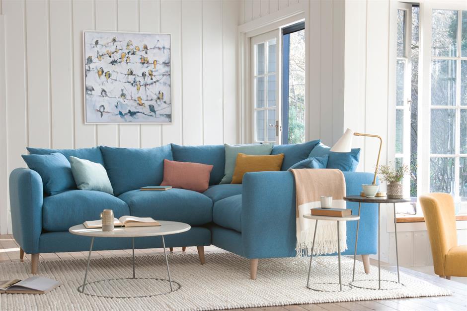
Trying to design a successful open-plan living space? When you're working with a blank canvas, it can be difficult to decide where to start. Rather than getting bogged down with accessories in your living room, start with the sofa.
Usually the largest piece of furniture in the room, it's easiest to plan your layout around this key feature. When it comes to positioning, consider the light, thoroughfares, and any views you might want to utilize. This also works for other rooms, whether it's the bed in a bedroom or a dining table in an entertaining area.
Be punchy with pattern

Combining different patterns in the same room can be tricky, but a good tip is to use contrasting patterns in similar colors, or the same pattern but in varying scales.
For example, try small florals mixed with big blowsy blooms. Or, go for bold geo shapes with contrasting botanicals but use the same colorways.
Accentuate with curves and arches
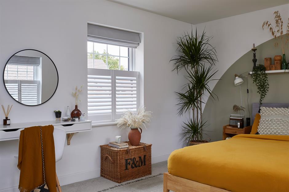
Curves, circles, and arches are having their moment, adding a softness to interiors that look both modern and classic.
We love how this clever bedroom design highlights the bed with a cool painted feature. The circular mirror cleverly echoes the curve of the paint effect, while cute cafe shutters add juxtaposition.
Sponsored Content
Embrace dark colours
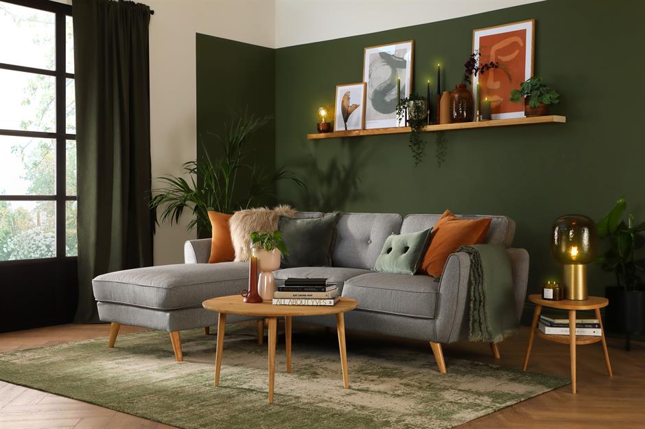
What’s the best way to make the most of a dark room? The instinctive answer might be to paint it bright white to reflect as much light as possible. But this can give a dingy room an off-putting, greyish tone that feels needlessly gloomy.
Instead, embrace the dark side and paint your walls in deep, rich hues to create an irresistibly cozy scheme that draws you in. Lighten the mood with a neutral-toned sofa, a few bright accents, and bright ceilings, and make sure you include plenty of layered lighting.
Make flooring cohesive
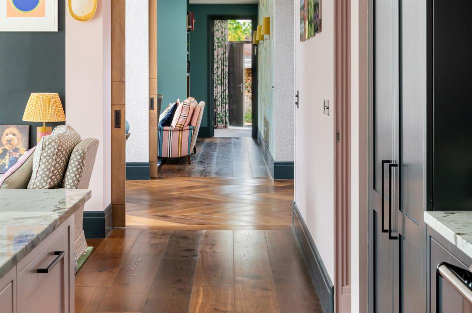
Using the same flooring throughout different rooms or areas in your home is an easy way to make the space feel much bigger than it is as well as create flow as with this rich-toned natural wood floor.
If you have large, open-plan rooms, use rugs to break up the continuity and divide the space according to use. This will create the impression of distinct sitting and dining areas that still pull together as part of the same, larger whole.
Balance the colour scheme

Want a failsafe way to proportion a three-color scheme? Stick to 60% for your dominant color, 30% for your secondary color, and 10% for your accent color.
To add a fourth color into the mix, split the secondary color or, at a push, the dominant color, but never the accent. If you go for a pop of red and embrace the unexpected red color theory you won't go wrong.
Sponsored Content
Nail the floor plan

Speaking of leaving enough space, it’s also important to make sure there is room to move around in less busy areas of your home. For example, you should ideally leave about 1.5 feet between sofas, chairs, and coffee tables in your living room.
This gives you plenty of space for sitting and moving around without having to stretch too far for your cup of coffee or shout across the room to have a conversation.
Dress the bed

A bedroom should reflect your personality and as the bed takes up so much physical and visual space it certainly needs attention. So, what better way to make an impact than with versatile bed linen that can easily be changed whenever the mood takes your fancy?
Look for good quality bed linen in colors and patterns that complement the surroundings and then layer like a pro with propped pillows, a throw blanket, and decorative cushions for a relaxed yet styled vibe.
Map out a gallery wall
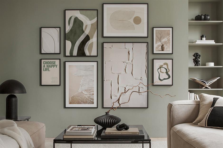
A staple in the interior design repertoire, the gallery wall is an exercise in creativity and balance – but not even the experts get it right the first time. To achieve that Instagram-worthy display, map out your design beforehand.
Cut out cardboard templates of each frame you want to hang and arrange them across the wall with Blu Tac until you find a combination that works, then simply swap for the real thing. Alternatively, why not buy a pre-selected gallery wall and follow the advised layout?
Sponsored Content
Remember the power of three
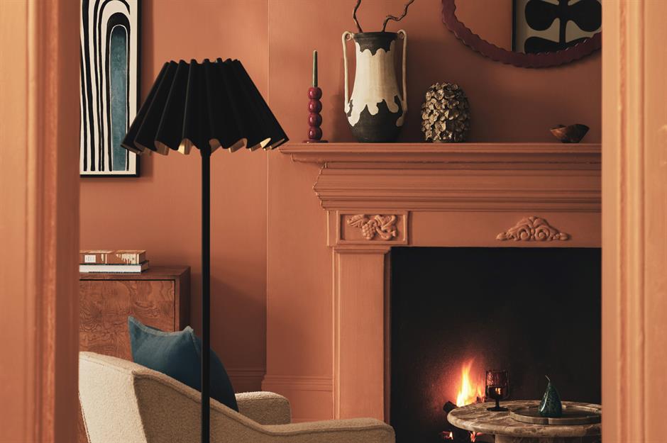
Three is most definitely a magic number when it comes to design – as are odd numbers in general.
Grouping odd numbers of items – be it colorful cushions or interesting vases and candles – forces the eye to move around the display, creating a level of visual interest that symmetrical, even-numbered arrangements simply can’t compete with.
Design around your line of sight
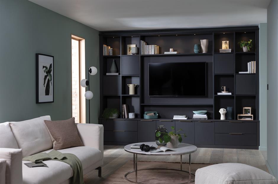
The best height to hang or stand a TV is at eye level in the position you’ll be watching it from. So in your living room, you’ll want it at the same height as your head when you’re sitting down or just above. Bespoke built-in shelves make a wise investment and incorporate the TV into a scheme, making it less obtrusive.
In a kitchen, you might want to hang it at your eyeline when you’re standing or sitting at a breakfast bar. The ideal TV viewing distance is about 1.5 times the diagonal span of your TV screen.
Plan throughfares
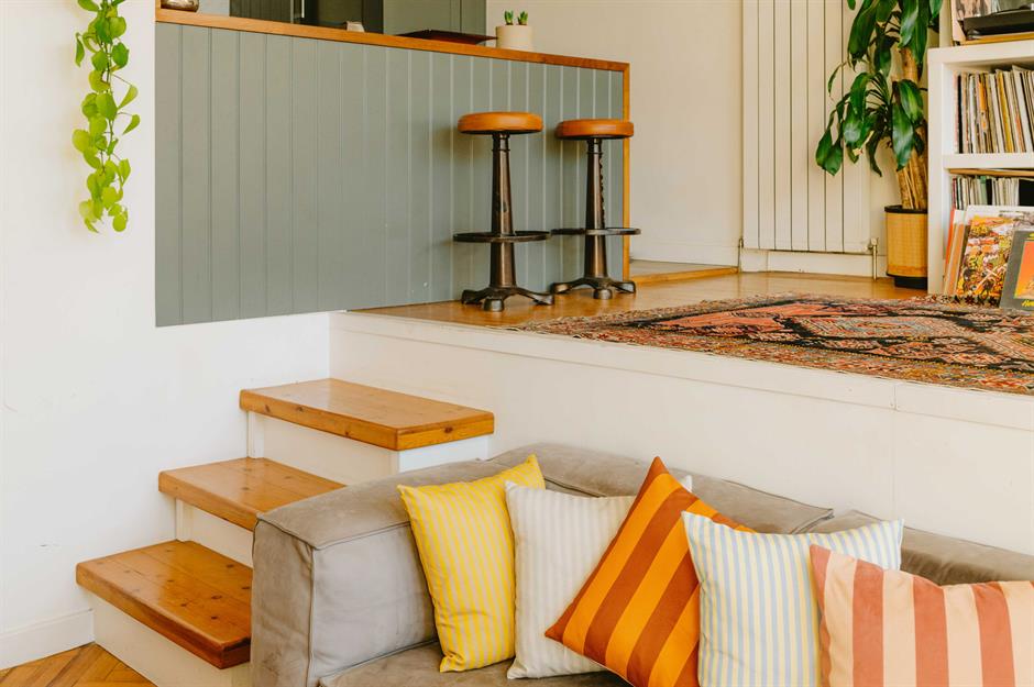
One of the most common design mistakes that non-designers make – especially in open-plan spaces – is cramming too much furniture into an area without leaving enough room for people to walk around comfortably.
The most frequently used thoroughfares in your home should be at least three feet wide – just enough for two people to pass each other. Alternatively, offer open plan areas close by narrow links like steps to make movement practical. This split-level room softened with muted colors and furnishings has nailed the method.
Sponsored Content
Hang full length curtains

Curtains can make or break a room. Opt for luxurious fabric, such as velvet, to create an opulent frame for your windows. One of the most common curtain mistakes is to hang them just above the top of the window frame, making the window – and the room – feel squat.
Hang them high to create a grand impression and make the room feel taller. Continue the luxurious look by hanging full-length curtains so your windows are draped from top to bottom.
Let the floor do the talking
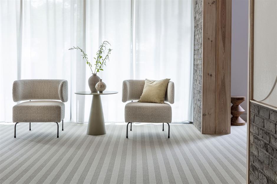
Just like ceilings, floors are often left as an afterthought in decorating schemes but a statement floor can create striking results that will add wow factor to the room.
The key is to incorporate balance, for instance, if the flooring is a busy pattern make sure the rest of the room is pared back and neutral. Look for furniture pieces with a small footprint and lift what you can off the floor.
Warm with wood

If a room lacks warmth and character, there's no better antidote than wood. While timber accessories and furniture are an easy way to lift a scheme and add texture, a 3D wall can really work wonders in a space without a focal point.
It doesn't have to cost the earth either – this urban apartment-inspired design can be achieved with narrow strips of reclaimed wood. For something more rustic, sand down the surface before installing.
Sponsored Content
Spin the colour wheel

The color wheel is an interior design essential. It can help you to plan your color pairings or guide you out of a design rut when you’re struggling for inspiration.
Use it to help you come up with complementary schemes (using colors from opposite sides of the wheel), analogous schemes (using colors next to each other on the wheel), or bolder schemes such as split complementary or triadic, which use three colors. This funky duvet proves colors don't have to be in the same tonal set to work wonders.
Liked this? Click on the Follow button above for more great stories from loveMONEY